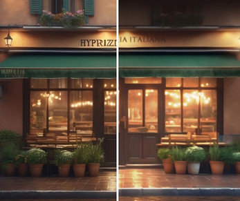
AI-made Backgrounds vs Rachel's Backgrounds: The Difference
A downloadable project
I want to take advantage of the latest pack to show you the differences between AI backgrounds and the backgrounds that I am selling here. This is for informative purpose only, for those who want to know what my input into the backgrounds is.
To begin with, the AI generations have small dimensions, so, my first step is to resize the image from approx. 1300 px to 2500 px. Once this is done, I move on to other modifications. Take a look:
Background 1 - Pizzeria's front.
AI Generation:
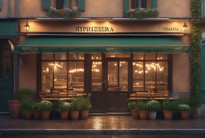
This is quite a nice pizzeria front image but it's obviously AI generated. The flawsinclude deformed captions on the pizzeria front door, deformed windows above, deformed lamps with no light, and generally poor lighting. Additionally, when you size-up, it looks like a bad jpg.
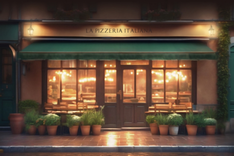
After spotting all these problems, I start fixing them. I begin by duplicating textures and using water and blur blushes to clean off the textures. I add a new caption then using a public domain font (to avoid a copyright issue).
Later, I put on a dark gradient above to hide the deformed windows. Then, I fix the lighting, using layers. By adding shadows in the upper, left and right part of the picture, I bring the front of the store out and later manipulate layers to make the pizzeria front and the ground in front of it, stand out more.
Lastly, I apply the "handpainted" effect that makes the picture look like it was digitally drawn and removes the low quality jpg problem. Lastly, I add lightning on the lamps which covers their imperfections. Done.
My background:
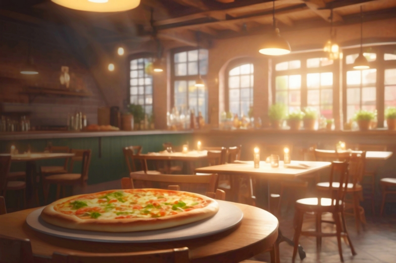
Background 2 - Pizzeria's interior
AI generation:
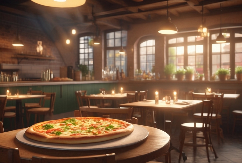
This is quite a nice AI generation. In fact, it's almost perfect, not much to change here... After resizing, I add a gradient on the left side to add depth to the room, and manipulate layers to have brighter colors on the right side. Later, I fix saturation and add a color layer to make it look warmer and more "cozy." And lastly, I add the handpainted effect. Done.
My background:
Background 3 - Corridor behind the pizzeria
AI generation:
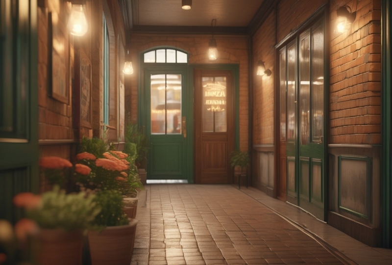
This is also a really nice generation. After resizing, I manipulate layers to make both sides of the picture look darker, and the center lighter. I add a gradient from top to add more light to the lamps. Later, I manipulate saturation to make flowers look better. Lastly, I apply the handpainted effect. Done.
My background:
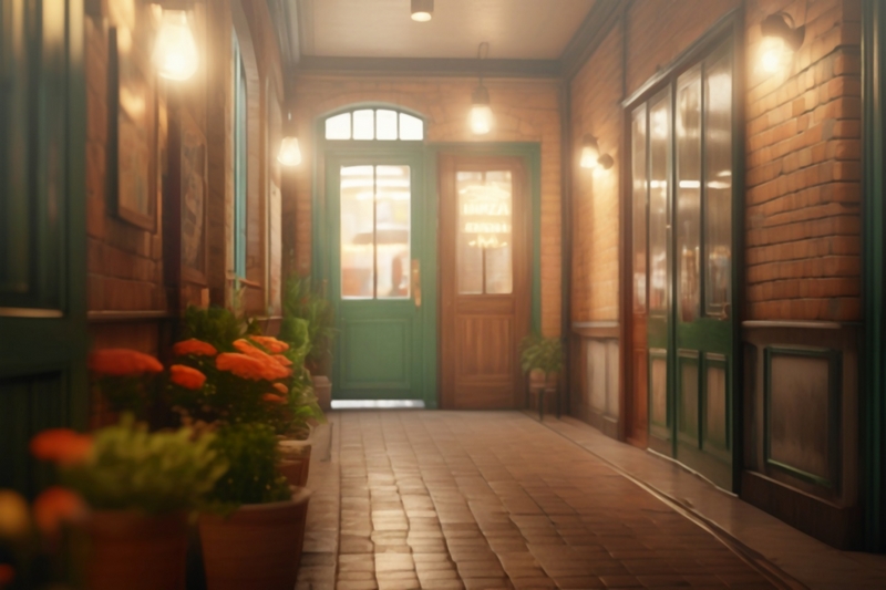
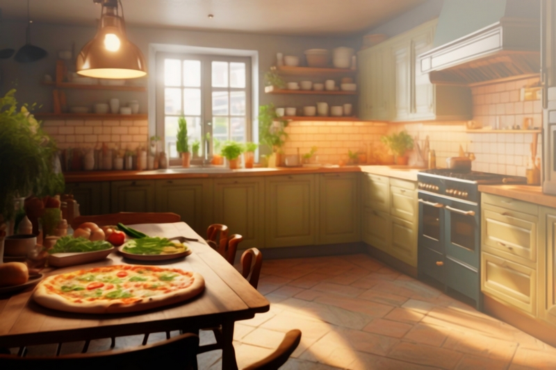
Background 4 - Kitchen with a pizza on the table
AI Generation:
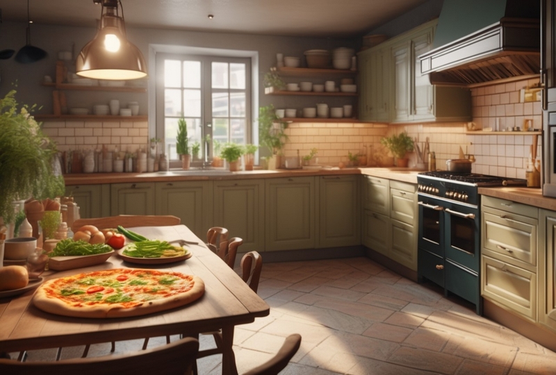
After resizing, I darken the lower half of the picture to bring out the window (light source). The multiply effect applied darkens the food on the table so I brighten it by making a hole in the layer hahaha. Then, to improve light and shadows of the place further, I apply a dark gradient on the left and then a beige one on the right, both with low opacity. Again, I make a hole in the layers to avoid getting the food on the table too dark. I also apply a white gradient in the top part of the picture, to make the room seem less like a lair hahaha. I then play a little with screen mode to make the furniture uniformly lighter, then fix saturation to have nicer colors, and again fix the pizza so it's not overly saturated. Lastly, I paint white over the window and blur it to create the light filtering in effect, then apply the final handpainted effect. Done.
Background 5 - Fresh produce market
AI Generation (3rd attempt):
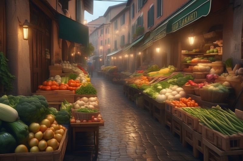
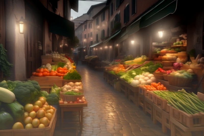
Here, I had a problem generating the background because there were people in the center. So I had to fix the prompt. The next visible problem - again, deformed texts. I fix them by painting over and blurring. Next step, I remove saturation a bit because it's a rainy day pack. I play with multiply mode to bring out the most important element - vegetables - and to darken the rest of the picture. I play with grayscale then, to make sky look grey as there were some remains of blue from earlier. I then apply a beige gradient on the bottom and a darker gradient on top. Later, some more playing with grayscale and saturation to bring out the vegetables even more. I add light to the lamps then to avoid having them darkened. Handpainted effect and done.
My background:
Background 6 - Pizza date
AI Generation (3rd attempt)
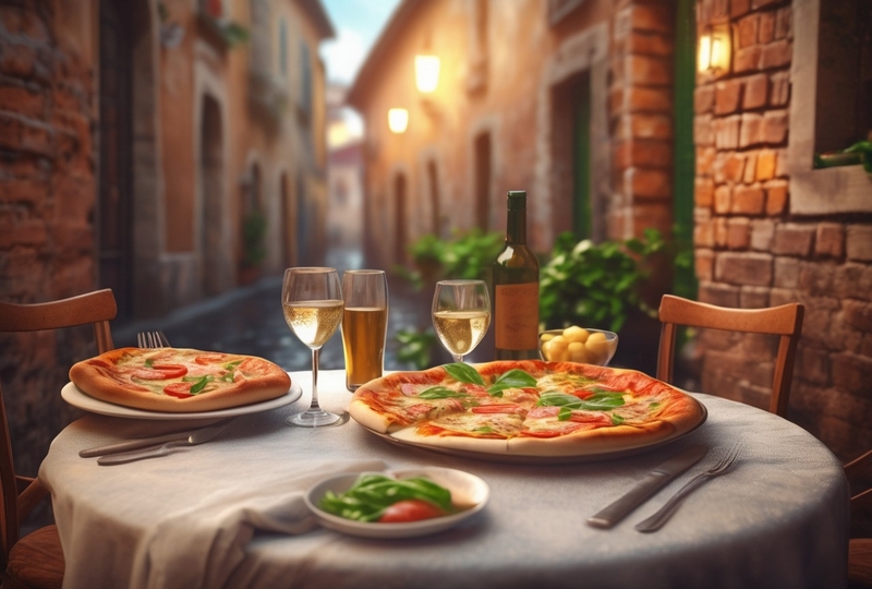
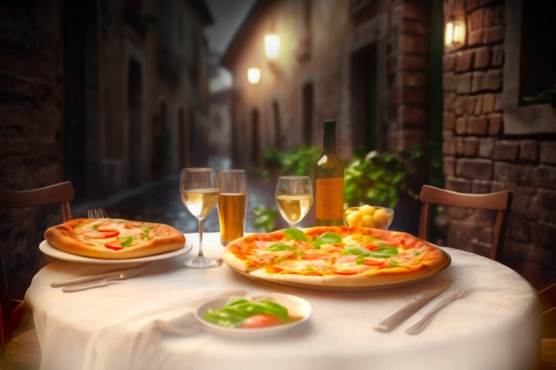
It was hard to generate a nice table without deformed chairs. I hate deformed chairs the most because they can ruin a seemingly perfect picture and are unfixable. I'm pretty sure you can already see what I did here. By using the multiply effect, and playing with saturation, I brought out the table into first plan. I applied greyscale on the sky, and dark gradient. I brought the lamps out and added light. Then, I painted the table more in white with the help of a brighter gradient. I then applied inverted color masks to put a warmer light on the meal. And lastly, I made the picture brighter to prevent it from being too dark. Then I add handpainted effect and it's ready.
My Background:
And this is it! It took me approximately an hour to make this little pack. And this is how my work for this shop mostly looks like - I edit every single background, to make sure that it's fit for game use.
When you are purchasing my backgrounds you are not only saving money on AI art subscriptions, but also getting the best result right away, without needing to additionally edit and retouch the images.
Backgrounds are free from defects and thanks to all the modifications applied, they don't look "AI-made" anymore but like backgrounds that were digitally painted by a human artist.
PS: You can purchase the Italian Pizzeria pack here if you like.
| Status | Released |
| Category | Other |
| Author | Rachel Chen |
